ShopDreamUp AI ArtDreamUp

Deviation Actions
![[6K AI ART] Girl in denim jacket](https://images-wixmp-ed30a86b8c4ca887773594c2.wixmp.com/f/ff6a1029-1c57-4dbe-b2b6-316ac012a690/dglx9ye-cc86c8b3-df7e-4713-91ba-2178f1e17264.png/v1/fit/w_375,h_250,q_70,strp/_6k_ai_art__girl_in_denim_jacket_by_fhlstudio_dglx9ye-375w.jpg?token=eyJ0eXAiOiJKV1QiLCJhbGciOiJIUzI1NiJ9.eyJzdWIiOiJ1cm46YXBwOjdlMGQxODg5ODIyNjQzNzNhNWYwZDQxNWVhMGQyNmUwIiwiaXNzIjoidXJuOmFwcDo3ZTBkMTg4OTgyMjY0MzczYTVmMGQ0MTVlYTBkMjZlMCIsIm9iaiI6W1t7ImhlaWdodCI6Ijw9ODU0IiwicGF0aCI6IlwvZlwvZmY2YTEwMjktMWM1Ny00ZGJlLWIyYjYtMzE2YWMwMTJhNjkwXC9kZ2x4OXllLWNjODZjOGIzLWRmN2UtNDcxMy05MWJhLTIxNzhmMWUxNzI2NC5wbmciLCJ3aWR0aCI6Ijw9MTI4MCJ9XV0sImF1ZCI6WyJ1cm46c2VydmljZTppbWFnZS5vcGVyYXRpb25zIl19.Ut5HitcYAlAwP1gNJWf1Tf6oLa--gYpTNneO6yQa4kQ)


Description
You can support me and gain more access to my art here:
Twitter: twitter.com/KoalaTheArtist
Instagram: www.instagram.com/koalathearti…
Watch the art live and in the making here:
Picarto: picarto.tv/KoalaTheArtist
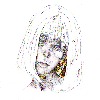
This started off as a practice for drawing lines and creases in clothing and then it turned into a outfit design idea. Haha, funny how drawing works. I really like this outfit and wish I could rock it like she can!
I made a poll asking if rather or not you guys would like to see sketches and doodles that I create on a regular (Sometimes Daily) basis and ALL of you said yes....so far. Haha. So for now on I will be uploading sketches that I do as well as finished works.
I normally take pictures of my sketches using my phone, or sometimes I scan them in, so the images will look different from time to time.
Twitter: twitter.com/KoalaTheArtist
Instagram: www.instagram.com/koalathearti…
Watch the art live and in the making here:
Picarto: picarto.tv/KoalaTheArtist
This started off as a practice for drawing lines and creases in clothing and then it turned into a outfit design idea. Haha, funny how drawing works. I really like this outfit and wish I could rock it like she can!
I made a poll asking if rather or not you guys would like to see sketches and doodles that I create on a regular (Sometimes Daily) basis and ALL of you said yes....so far. Haha. So for now on I will be uploading sketches that I do as well as finished works.
I normally take pictures of my sketches using my phone, or sometimes I scan them in, so the images will look different from time to time.
Image size
1512x2010px 1.43 MB
© 2017 - 2024 KoalaTheArtist
Comments8
Join the community to add your comment. Already a deviant? Log In
Hey-o! I'm here from ProjectComment with some Comment tag!
My tag-word was 'figure', and I had a tough time deciding which one of your pieces to comment on, for sure. xD
First off, I love the pose here. It's very sassy, and you can see her attitude in every line of the picture. It's wonderful. There are a couple of issues I'd like to point out, however.
Okay, first thing, you might want to work on trying to make the images more clear when you scan them. This is always a task when traditional artwork, but whether you take photos of the artwork and then upload it, or scan it and then upload it, it might benefit you to try to use some method to make the lines clearer. Most digital painting programs have a filter that you can use that helps make grey lines darker, so you might want to fiddle around with that to try and make it more visible.
The second thing I find issue with is the face. Part if it is probably because the face is small and not the main focus, but I've noticed that the eyes look slightly out of focus. I don't see any defining pupils, and while that gives it a specific look, it also sort of makes her look like she's daydreaming while walking. Probably not smart. The cheek-bone line also looks a little off, and I think it should be placed a little closer to the mouth.
The last thing I have to talk about is the arms; particularly the arm that's swinging forward as she walks. It looks slightly too long. Your elbow is in the right place, so I think all you need to do is down-size the hand, which looks a little too bit anyways. Try put your hand flat over one of your eyes. It generally comes about from the edge of your cheek to your eyebrow. Both of her hands could cover her entire face by themselves. You also might want to try making the shoulder a little more round and less square.
Just one note before I wrap things up: I've noticed that all your girls have extremely tiny waists. While that isn't necessarily bad...it isn't good either. Generally the only way that a girl could look that skinny is if they are starving themselves, and thus your girls look a little...sickly. You might want to try giving them a little more meat on their waists. (Wink)")
Other than these things though, I love this image! The figure and pose are very good, and the proportioning is almost perfect! I hope that my comments help, and that you continue to draw. ^^
Your tag-word is 'star'. Please go to the gallery of and comment there!
My tag-word was 'figure', and I had a tough time deciding which one of your pieces to comment on, for sure. xD
First off, I love the pose here. It's very sassy, and you can see her attitude in every line of the picture. It's wonderful. There are a couple of issues I'd like to point out, however.
Okay, first thing, you might want to work on trying to make the images more clear when you scan them. This is always a task when traditional artwork, but whether you take photos of the artwork and then upload it, or scan it and then upload it, it might benefit you to try to use some method to make the lines clearer. Most digital painting programs have a filter that you can use that helps make grey lines darker, so you might want to fiddle around with that to try and make it more visible.
The second thing I find issue with is the face. Part if it is probably because the face is small and not the main focus, but I've noticed that the eyes look slightly out of focus. I don't see any defining pupils, and while that gives it a specific look, it also sort of makes her look like she's daydreaming while walking. Probably not smart. The cheek-bone line also looks a little off, and I think it should be placed a little closer to the mouth.
The last thing I have to talk about is the arms; particularly the arm that's swinging forward as she walks. It looks slightly too long. Your elbow is in the right place, so I think all you need to do is down-size the hand, which looks a little too bit anyways. Try put your hand flat over one of your eyes. It generally comes about from the edge of your cheek to your eyebrow. Both of her hands could cover her entire face by themselves. You also might want to try making the shoulder a little more round and less square.
Just one note before I wrap things up: I've noticed that all your girls have extremely tiny waists. While that isn't necessarily bad...it isn't good either. Generally the only way that a girl could look that skinny is if they are starving themselves, and thus your girls look a little...sickly. You might want to try giving them a little more meat on their waists.
Other than these things though, I love this image! The figure and pose are very good, and the proportioning is almost perfect! I hope that my comments help, and that you continue to draw. ^^
Your tag-word is 'star'. Please go to the gallery of
and comment there!